📈 IELTS Writing Task 1: Line Graph Guide with Model Answer
9 min read
2026-06-20
Master IELTS Writing Task 1 line graphs with a complete guide. Learn trend vocabulary, paragraph structure, and see a full band 9 model answer with annotations.
EngSandbox Editorial Team
Written with AI assistance and reviewed by our editors — experienced PTE/IELTS tutors. Every article is fact-checked against official band descriptors, the Academic Word List and Cambridge assessment research, then field-tested with learners before publishing. Human reviewed + field tested. Questions? Contact us — see our Editorial Process.

Twenty minutes. That is roughly your budget for Task 1, because the exam gives you one hour in total and Task 2 deserves the larger share. You open the booklet, and there it is: a line graph with three coloured lines snaking across twenty years of data — one climbing, one sagging, one wobbling somewhere in between. Somewhere behind you, another candidate is already writing. Your mind goes blank.
If that scene feels familiar, you are in good company. Even learners with excellent English freeze when several lines rise, fall, and cross at once. Here is what I tell every student before they start: describing a line graph is one of the most learnable tasks in the whole exam. The graphs change from test to test, but the skills never do — a fixed structure, a compact set of trend vocabulary, and a calm method for choosing what to mention. Master those three things, and the blank-mind moment disappears.
In this guide we will build exactly that system together: first the vocabulary, then the paragraph plan, then the small language points that make descriptions precise. Finally, we will take one graph from empty page to finished answer, and I will show you why each sentence earns its place against the official scoring criteria.
What the Task Is Actually Testing
In Writing Task 1 you may be given a line graph (sometimes called a line chart) showing how something changed over time. Your job is not to give opinions or explanations. Your job is to report the information clearly and accurately, highlighting the main trends and making the key comparisons.
Your response is scored against four official criteria, each worth a quarter of the marks: Task Achievement, Coherence and Cohesion, Lexical Resource, and Grammatical Range and Accuracy. For a line graph, that translates into four practical demands:
- Task Achievement: Select and report the key features of the graph — not every tiny wiggle — and include a clear overview of the main trends.
- Coherence and Cohesion: Organise the information logically and link it smoothly.
- Lexical Resource: Describe change with varied, precise vocabulary rather than repeating "went up" and "went down".
- Grammatical Range and Accuracy: Use a mix of sentence structures accurately, especially past tenses for historical data.
One official detail deserves its own warning: the public descriptors describe a Band 5 response as having no clear overview. Skip the overview, and no amount of good grammar can lift your Task Achievement mark. We will make sure yours is impossible to miss.
The Vocabulary That Does the Heavy Lifting
This is where many candidates lose marks unnecessarily, recycling two or three verbs across twenty sentences. Examiners notice. The table below covers almost every movement you will ever need to describe.
| Movement | Verbs | Nouns | Natural Collocations |
|---|---|---|---|
| Going up | rise, increase, climb, grow, surge | a rise, an increase, growth, a surge | a steady rise, a sharp increase, grew rapidly |
| Going down | fall, decrease, decline, drop | a fall, a decrease, a decline, a drop | a gradual decline, a slight drop, fell sharply |
| Staying level | remain stable, stay constant, level off | a period of stability | remained broadly unchanged |
| Changing direction | fluctuate | fluctuation | significant fluctuations |
| Reaching the top | peak, reach a peak | a peak | peaked at approximately 500 |
| Reaching the bottom | bottom out, reach a low | a low point | bottomed out at just under 100 |
Three principles govern how you use this table:
-
Match the size of the word to the size of the change. A gentle upward drift calls for rose slightly; a steep jump calls for surged or soared. A small change deserves a small word; a big change deserves a big word. Exaggeration reads as inaccuracy.
-
Learn collocations, not single words. A sharp increase and a sharp rise are both natural, but not every adjective pairs happily with every noun. Because growth is normally uncountable, "a significant growth" sounds wrong; the natural form is simply "significant growth". Notice these partnerships as you read.
-
Use adverbs and prepositions to add precision. Compare "the number rose" with "the number rose steadily". Adverbs such as gradually, sharply, steadily, slightly, and considerably sharpen meaning at no grammatical cost. Prepositions do the same work around figures:
- The figure rose from 3 million to 5 million. (from ... to ... spans the range)
- There was an increase in attendance of about 2 million. (an increase in + thing measured; of + amount)
- Sales peaked at 6.8 million. (peak at + figure)
A Structure You Can Rely On: Four Paragraphs
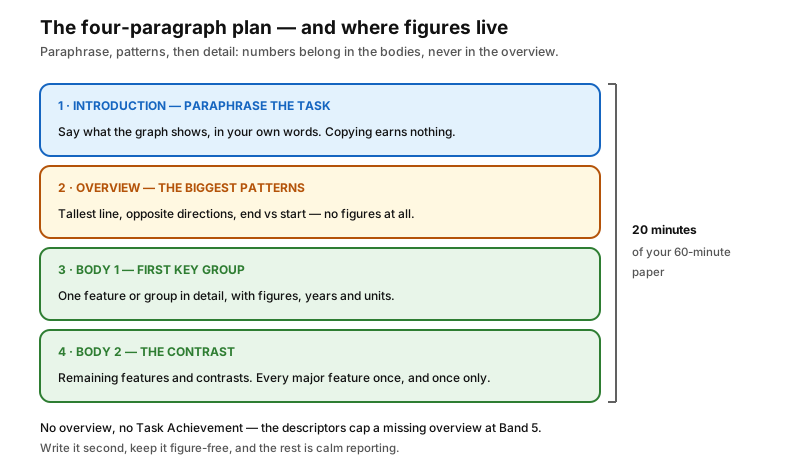
Under time pressure, decisions cost seconds. Make them now, and exam day becomes pure execution. This four-paragraph plan works for nearly every line graph.
Paragraph 1 — Introduction (one or two sentences)
Paraphrase the question: say what the graph shows, in your own words. Copying whole phrases from the task earns nothing.
Task: The line graph below shows the number of visitors to three London museums between 2000 and 2020.
Paraphrase: The line graph illustrates how many people visited three museums in London over a twenty-year period.
Notice the moves: shows became illustrates, the number of visitors became how many people visited, and between 2000 and 2020 became over a twenty-year period. Small, safe substitutions are all it takes. We will return to this exact task later and build a complete response.
Paragraph 2 — Overview (two or three sentences)
This is the most important paragraph you will write. State the two or three biggest patterns — the tallest line, the contrasting directions, the standout feature — without specific figures. A useful test: if a friend glanced at the graph from across the room and asked what it showed, what would you tell them first?
Ask yourself: Which line dominates? Which trends move in opposite directions? Where does the period end compared with where it began?
Paragraph 3 — Body Paragraph 1 (three or four sentences)
Describe the first key feature or group in detail, this time with figures: years, amounts, units. Group lines that behave similarly so the reader can follow the comparison.
Paragraph 4 — Body Paragraph 2 (three or four sentences)
Cover the remaining key features and any contrasts between them. When you finish, every major feature should have been mentioned once — and only once.
Reporting Numbers Without Overclaiming
A few small conventions separate careful reports from clumsy ones:
- You cannot read exact values off a drawn line, so hedge honestly: "stood at approximately 4.5 million", "around 5 million".
- Use just over and just under for values close to a round number: "peaked at just under 3 million".
- Say "in 2005", never "at 2005". Report values with phrases like "the figure stood at" or "visitor numbers reached" — not "the number was put at".
- Carry the units through the whole answer — millions, thousands, percentages. An answer without units quietly distorts every figure it contains.
Worked Example: From Task to Finished Answer
Here is a practice task written in the style of the exam, together with the data you would see on the graph. Study the data and sketch your own overview before you read the model — comparing your choices with ours is where the learning happens.
The Task
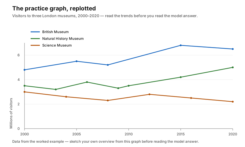
The line graph shows the number of visitors (in millions) to three London museums — the British Museum, the Natural History Museum, and the Science Museum — between 2000 and 2020.
The data behind the lines:
- British Museum: about 4.8 million visitors in 2000, rising steadily to about 5.5 million in 2005, dipping slightly to around 5.2 million near 2008, then climbing sharply to a peak of roughly 6.8 million in 2015 before settling at about 6.5 million in 2020.
- Natural History Museum: about 3.5 million in 2000, fluctuating between 3.2 and 3.8 million until 2010, then rising gradually to about 5 million in 2020.
- Science Museum: about 3 million in 2000, following a general downward trend with a brief recovery to around 2.8 million in 2012, then falling to approximately 2.2 million by 2020.
The Model Answer
The line graph illustrates how many people, measured in millions, visited three major museums in London — the British Museum, the Natural History Museum, and the Science Museum — over a twenty-year period from 2000 to 2020.
Overall, the British Museum was the most popular attraction throughout the period, while the Science Museum received the fewest visitors. It is also clear that attendance at the Natural History Museum followed an upward path, whereas visitor numbers at the Science Museum declined overall.
The British Museum welcomed approximately 4.8 million visitors in 2000, and the figure climbed steadily to around 5.5 million by 2005. After a slight dip to around 5.2 million in 2008, visitor numbers surged to a peak of roughly 6.8 million in 2015, before settling back at approximately 6.5 million by the end of the period.
By contrast, the Natural History Museum and the Science Museum began the period at lower levels of around 3.5 million and 3 million visitors respectively. Attendance at the Natural History Museum fluctuated between 3.2 and 3.8 million until 2010, before rising gradually to reach approximately 5 million in 2020. The Science Museum followed a broadly downward path: after a temporary recovery to around 2.8 million in 2012, its figures fell to just 2.2 million by the end of the period.
(around 215 words)
Why This Answer Works
Let us walk through it criterion by criterion, because these qualities — not any promised score — are what you want to make your own.
Task Achievement. The introduction paraphrases the task without lifting phrases from it. The overview states the two big stories — the British Museum's dominance and the opposing directions of the other two museums — and deliberately contains no figures; details belong in the body paragraphs. Both body paragraphs support their trends with specific years and values, and the units (millions) run through the whole response.
Coherence and Cohesion. Information flows introduction → overview → detail. Related data is grouped sensibly: the British Museum stands alone in paragraph three because its trend is distinct, while the other two museums share paragraph four because comparing them is the point. Connectives do quiet work: after a slight dip, before settling back, by contrast, respectively.
Lexical Resource. Trend verbs stay varied and correctly sized: climbed steadily for a gentle rise, surged to a peak for a dramatic one, alongside dip, fluctuated, fell. Phrasing shifts flexibly between verbs and nouns: attendance followed an upward path, a temporary recovery, settling back at.
Grammatical Range and Accuracy. Past simple handles the completed history correctly (began, climbed, fluctuated, fell). A reduced participle clause opens the answer (measured in millions), and varied subordination keeps the rhythm alive (before + -ing, after + noun phrase, a colon introducing an explanation). Every figure is hedged appropriately: approximately, around, roughly, just.
Six Mistakes That Cost Marks
When we review Task 1 answers together, these six appear constantly. Each has a simple fix.
1. Describing every data point. You are a reporter, not a human printer. If a line wobbles between 3.9 and 4.1 for a decade, write "the figure remained relatively stable, at around 4 million" and move on. Selection is part of the skill being tested.
2. Burying the overview — or stuffing it with numbers. The overview carries general patterns only. Save every figure for the body paragraphs. If your overview contains a year or an amount, it is doing the wrong job.
3. Misusing "the number of". "The number of visitors" counts people, so it works. But "the number of the British Museum" means nothing; say "the figure for the British Museum" or "visitor numbers at the British Museum". Always ask yourself: number of what, exactly?
4. Copying the question's wording. The introduction must be paraphrased. If the task says shows, reach for illustrates, depicts, or compares. If it says between 1990 and 2010, try over a twenty-year period. Small substitutions add up to visible paraphrasing skill.
5. Writing a conclusion that gives your opinion. Task 1 is descriptive, not discursive. Never write "In conclusion, I believe the Science Museum deserves more funding...". Nothing in the data supports opinions, and the overview — placed near the start — replaces the conclusion entirely. Some candidates even train themselves to hear "overview" whenever they think "conclusion", which keeps the temptation away.
6. Forgetting the units. If the graph measures visitors in millions or spending in billions, say so. A sentence like "sales reached 12" is meaningless; "sales reached 12 billion dollars" is information.
Two-Minute Workout: Spot the Errors
Before we finish, try this quick correction exercise:
"The line graph shows the number of tourist in Japan from 2010 to 2020. The figure was rose steadily from 8 million to 12 million."
Find both errors before reading on.
Here are the corrections:
- "tourist" should be "tourists" — after the number of, a countable noun takes the plural.
- "was rose" is impossible English. Use either "rose steadily" (past simple) or "was rising steadily" (past continuous) — but never combine was with a past simple verb.
Errors like these cost marks under Grammatical Range and Accuracy, yet two minutes of proofreading catches almost all of them. Build those two minutes into every practice session now, so they happen automatically on test day.
Short on Time? Train One Skill at a Time
Not everyone can study for hours daily, and you genuinely do not need to. These drills each target one skill and fit into small pockets of time:
The five-minute vocabulary drill. Pick one row of the trend vocabulary table and write three sentences using words from it. One row per day means you will have cycled through the whole table in a week.
The ten-minute overview challenge. Find a sample graph — free examples are available through official preparation materials such as the British Council's Take IELTS resources. Set a timer for ten minutes and write only the overview paragraph. Choosing what matters most is the hardest skill in Task 1, so give it focused reps.
The voice-memo technique. No time to write? Describe a graph out loud and record it on your phone, then listen back: Did the vocabulary vary? Did the key trends appear? Speaking forces real-time organisation, which feeds directly back into writing.
Read one model answer a day. Absorption counts as study. Reading a well-written response each evening trains your ear for sentence patterns until they surface in your own drafts without conscious effort.
Fifteen focused minutes a day will always beat a three-hour session once a week — consistency is the entire secret.
Your Exam-Day Checklist
Run through this list during practice, and it will run itself on test day:
- Am I spending about twenty minutes on Task 1 (of the sixty minutes shared with Task 2)?
- Have I written at least 150 words?
- Have I paraphrased the task in my introduction?
- Does my overview state the main trends without specific figures?
- Have I grouped related data logically across two body paragraphs?
- Have I included specific figures — with their units?
- Have I varied my trend vocabulary rather than repeating "went up" and "went down"?
- Have I mixed simple and complex sentences?
- Have I left two minutes to proofread?
Between Now and Test Day
That blank-mind moment from the start of this guide? It fades with repetition. The vocabulary table gives you the words; the four-paragraph plan gives you the order; the worked example shows what finished looks like. Nothing here depends on talent — only on reps.
So here is a simple schedule. Today: copy out five phrases from the vocabulary table and use each in a sentence about the museum graph. Tomorrow: write a full overview paragraph for another graph, figures banned. The day after: attempt a complete answer in twenty minutes, then check it against the checklist above.
Each pass strengthens exactly the muscles the exam tests, and within a couple of weeks you will notice yourself reading any graph calmly — seeing trends instead of tangles. That calm is built one practice response at a time, and yours starts with the very next one.
Related Articles
📊 IELTS Writing Task 1: How to Describe a Bar Chart Like a Band 8
Learn how to describe a bar chart in IELTS Writing Task 1 with a Band 8 approach. Master overview writing, data comparison, and structured paragraph organisation.
✍️ IELTS Writing Task 2: The Foolproof 4-Paragraph Essay Structure for a Band 7+
Master the IELTS Writing Task 2 with a simple, foolproof 4-paragraph essay structure. Learn how to plan, write, and polish your essay for a Band 7 or higher.
🔗 20 Linking Words That Boost Your IELTS Writing Score
Master 20 essential linking words to improve your IELTS Writing coherence and cohesion. Learn how to connect ideas smoothly and boost your band score.